Component Library
 Security and navigation
PERMISSIONS Refer to Components > Components in Permissions.
NAVIGATION Automation > Components
About
The Component Library displays a list of all components that you have downloaded from the ComStore or created yourself. An ! icon indicates that there are updates available for your components. Refer to Update Needed.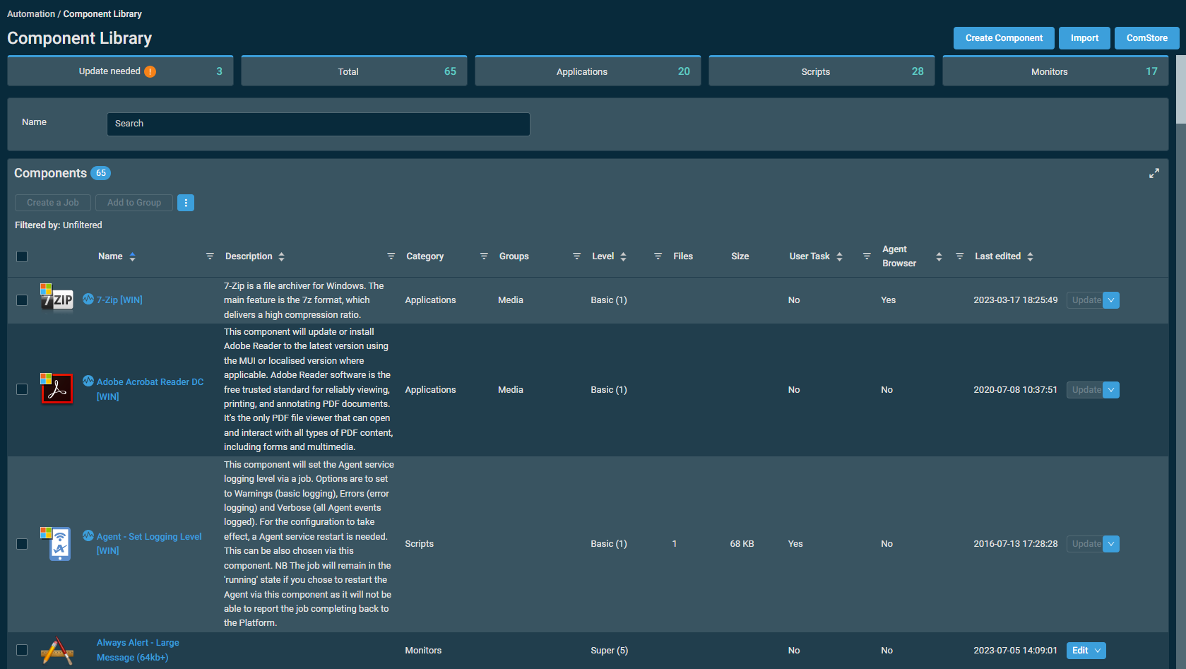
Please note the following advisory when viewing components downloaded from the ComStore or copies of those components:
NOTE Unless otherwise stated, ComStore scripts are owned by Datto and are provided to Datto partners solely for internal use and/or for servicing the clients of Datto partners in conjunction with an active Datto RMM subscription. Any other use or redistribution is prohibited without explicit approval from Datto.
If you require component-related support, refer to Getting support for components.
Creating a component
You can create a new component by clicking the Create Component action button displayed at the top of the page. Refer to Creating a component.
Copying a component
Create a new component that is prepopulated with an existing component's details. The new component will be named Copy of [existing component's name] by default. Refer to Creating a component.
NOTE Version and update information is not displayed within the components table for copied components.
Importing a component
You can import a component by clicking the Import action button displayed at the top of the page.
Once imported, you can modify the component's details in the same manner as creating or editing a component. Refer to Creating a component. You can also delete, copy, or export the component using the buttons at the top of the component's detail page. Refer to Viewing and editing component details.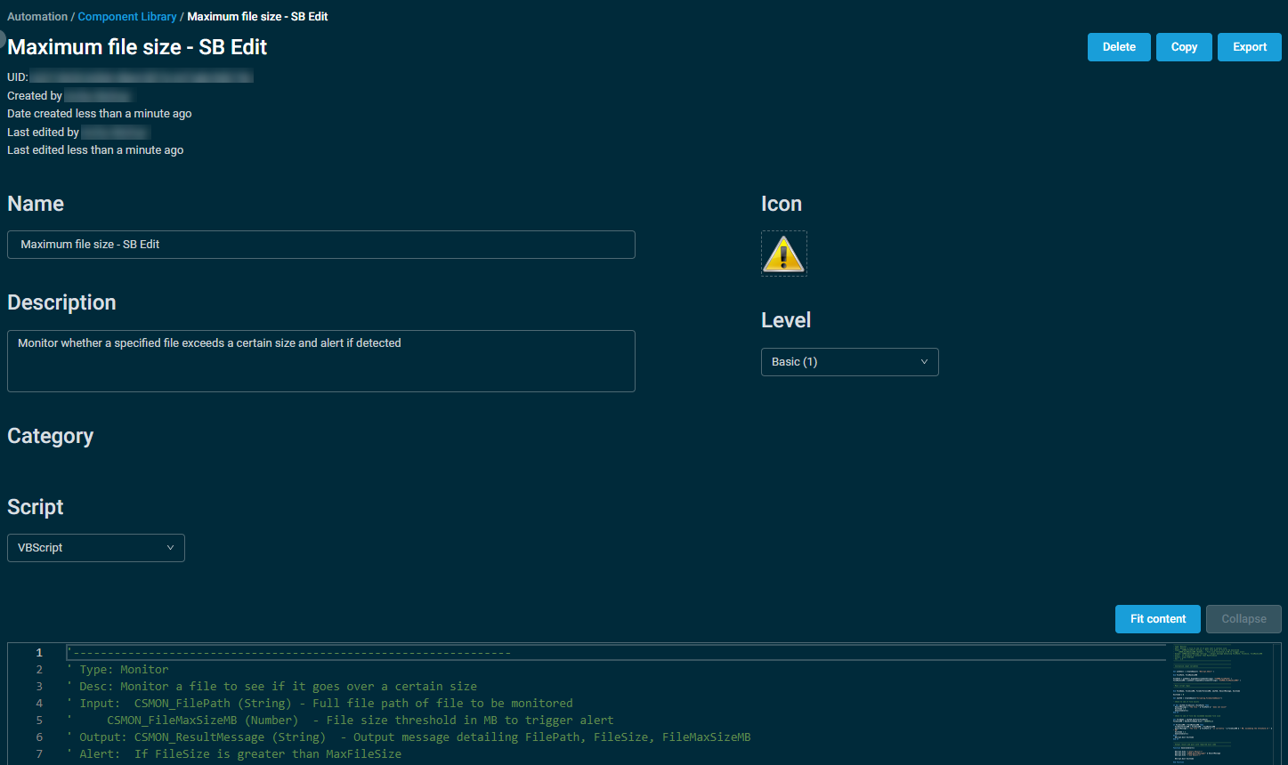
Click Save Component when finished to save the imported component to your Component Library.
NOTE Only components in .cpt file format can be imported.
Exporting a component
Exporting a component allows you to share a copy of a component you have created (for example, by uploading it to the Community ComStore. Refer to Community ComStore).
You can export one component at a time via the Row Actions icon or the drop-down menu at the end of an individual component row. Refer to Export in Action buttons.
ComStore components must be copied to your Component Library before they can be exported. Refer to List of ComStore components. If a component is not available for exporting, the Export action is not visible.
Upon exporting, the component is automatically downloaded to your device in .cpt file format.
ComStore
You can navigate to the ComStore by clicking the ComStore action button displayed at the top of the page. Refer to ComStore.
Component categories
At the top of the page, components are sorted into categories. The categories are as follows:
| Category | Description |
|---|---|
| Update Needed | All components with updates available. NOTE Only displayed for users that have Manage permission for Components > Components. Refer to Permissions. |
| Total | Displays the total number of components. |
| Applications | Refer to Applications. |
| Scripts | Refer to Scripts. |
| Monitors | Refer to Monitors. |
You can also create component groups and associate components with them based on your own criteria. This is helpful if you have components that are frequently viewed or edited. Refer to Add to Group.
Component name search
Enter a term to search for a component by name (search results are narrowed as you type), then select the component from the list. Search results depend on your component level. Refer to Component Level.
If a search term includes wildcard characters (for example, underscores and percent signs), they serve as normal characters if they are preceded by a backslash. For details, refer to Wildcard characters.
The components table
The components table displays the following columns:
| Field | Sortable? | Description |
|---|---|---|
| Name |

|
The name of the component. Click the hyperlink to view or edit the component's details. Refer to Viewing and editing component details. To narrow the list, click the filter icon  , enter a term, and click Apply. To see the full list, click Reset. , enter a term, and click Apply. To see the full list, click Reset. |
| Description |
|
The description of the component. To narrow the list, click the filter icon , enter a term, and click Apply. To see the full list, click Reset. |
| Category | The category type of the component. Click the filter icon and click Applications, Monitors, or Scripts to filter by the type of component. You can filter by multiple categories. |
|
| Groups | The groups this component has been added to. To narrow the list, click the filter icon , enter a term, and click Apply. To see the full list, click Reset. |
|
| Level |

|
The component level of the component, which determines which users can access the component. To learn how to configure which components a user can see, refer to Component Level in Users. Click the filter icon and click Basic (1), Low (2), Medium (3), High (4), or Super (5) to filter by one or multiple component levels.You can edit a component's component level on the component details page if you have Manage permission for Components > Components. Refer to Viewing and editing component details and Permissions in Security levels. |
| Files | The number of files associated with this component. | |
| Size | The size of this component. | |
| User Task |
|
Displays if this component has been set as a User Task. For more information, refer to User Tasks. Click the filter icon and click Yes or No to filter the list. To see the full list, click All. |
| Agent Browser |
|
Displays if this component is visible in the Agent Browser. For more information, refer to Show/Do Not Show in Agent Browser. Click the filter icon and click Yes or No to filter the list. To see the full list, click All. |
| Last Edited |
|
The date the component was last updated. |
| Individual component actions | Various actions can be performed on an individual component at the end of the component's row in the table. Hover over the V icon next to the button to access all available actions. The type of component determines which actions are available. Refer to Action buttons. |
You can filter any columns with the filter icon . The Filtered by bar displays all applied column filters. If a filter search term includes wildcard characters (for example, underscores and percent signs), they serve as normal characters if they are preceded by a backslash. For details, refer to Wildcard characters. Click the X next to any filter to remove that filter or click Reset Filters to remove all filters. If no filter is applied, the Filtered by bar displays Unfiltered. The filter selection in the columns will persist the next time the page is accessed.
The table density is set to condensed theme by default. To change it to relaxed theme, click the density toggle icon.  The selection will persist across all pages.
The number of results displayed can be specified by selecting the desired number from the pagination control. This selection will persist the next time the page is accessed.
Action buttons
The action buttons are unavailable if no row is selected or if the action is not applicable to the selected rows. The check boxes allow you to select one or more rows. Select all rows shown on the page by selecting the check box in the table header. To access all action buttons, click the Row Actions icon. The table below lists all available action buttons.
| Action Button | Description |
|---|---|
| Create a Job | This action is only available for the categories Applications and Scripts. The new job will be populated with the selected component. You can perform this action on only one component at a time. Also available as an individual component action. Refer to Creating a job. |
| Add to Group | This action is only available for the categories Applications and Scripts. A message will be displayed if a monitor component type is selected. Also available as an individual component action. In the confirmation dialog box that appears, select an existing group to add the components to, or add them to a new group. If you are adding components to a new group, enter a name for the group. Click Add to execute the action or Cancel to close out of the dialog box. 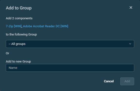 |
| Update | Allows you to update a component. This action only appears for components that have an update available. You can perform this action on only one component at a time. When accessing it as an individual component action, hovering over the button will show the release notes and version number of the component update.  |
| Update All | Allows you to update all components that have an update available at once. No check box selection is required. The confirmation dialog box that appears will list all components to be updated. Click Confirm to execute the action or Cancel to close out of the dialog box. |
| Copy | Allows you to copy a component. You can perform this action on only one component at a time. Also available as an individual component action. Refer to Copying a component. |
| Remove from Group | Allows you to remove a component from a group. You can perform this action on only one component at a time. Also available as an individual component action. In the confirmation dialog box that appears, select the group from the drop-down list and click Remove to execute the action or Cancel to close out of the dialog box.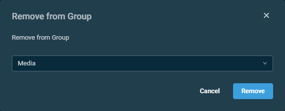 |
| Groups | Allows you to view a list of all component groups in alphabetical order.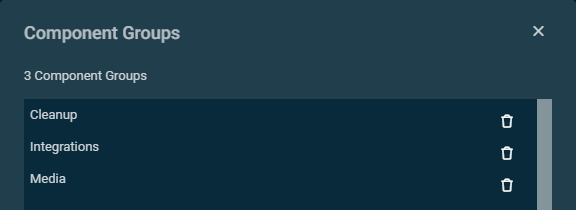 You can delete a group from the list by clicking the delete icon |
| Show/Do Not Show in Agent Browser | This action is only available for the categories Applications and Scripts. It allows you to control the visibility of components in the Agent Browser. You can perform this action on only one component at a time. |
| Set/Unset as User Task | This action is only available for the categories Applications and Scripts. An error message will be displayed if a monitor component type is selected. It allows you to set the component as available or unavailable to all end users with a Datto RMM Agent installed on their computer. You can perform this action on only one component at a time. Also available as an individual component action. For more information, refer to User Tasks. |
| Delete | Allows you to delete a component. You can perform this action on only one component at a time. Also available as an individual component action. Note that anything currently associated with the component (for example, jobs or monitors) will be affected. In the confirmation dialog box that appears, click Remove to execute the action or Cancel to close out of the dialog box. |
| Export | Allows you to export a component. You can perform this action on only one component at a time. Also available as an individual component action. Refer to Exporting a component. |
| Uncheck All | Clears all selected rows. The number of selected rows is indicated next to the Row Actions icon. |
| View | Allows you to view the component's details page (read-only). Only available as an individual component action. Refer to Viewing and editing component details. |
| Edit | Allows you to edit the component's details. Only available as an individual component action. Refer to Viewing and editing component details. |
 next to the group name. Click Confirm to execute the action or Cancel to close out of the dialog box. The deletion cannot be undone.


